


Uniting the region’s top children’s hospitals and healthcare providers, Intermountain’s first dedicated children’s health brand was designed to meaningfully connect with kids and their families.
The Opportunity:
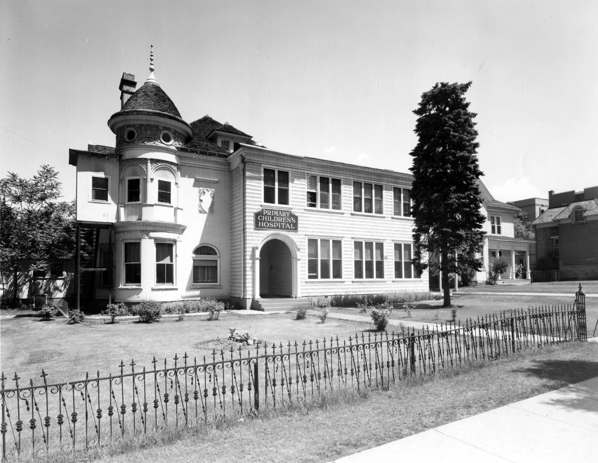
Primary Children’s Hospital in Salt Lake City has been serving children across the mountain west for over a century. Consumers (especially in Utah) rated the hospital extremely high on brand recognition and preference, however the hospital was never meant to be a brand itself. In fact, many consumers didn’t know Primary Children’s was a part of Intermountain Health, and when they learned of the connection preference for the hospital and the parent brand increased significantly.
Furthermore, our footprint has expanded to three hospital campuses in Utah, dedicated children’s health services at Montana’s St. Vincent Regional Hospital, and a children’s hospital in Las Vegas opening in 2030 – Nevada’s first stand-alone children’s hospital. A singular, meaningful children’s health to united Intermountain’s pediatric offerings was needed to expand the goodwill from Primary Children’s across all the system’s children’s health services in the region.

The Solution:
A sister brand to Intermountain Health. A brand focused on kids, validating their experiences in healthcare settings, and designed with clinical and marketing goals in mind. A brand to launch three new hospitals over the next decade. A brand to represent the nation’s model health system for children.
The Brand:
Though the logo for Intermountain Children’s Health is almost identical to Intermountain Health, the rest of the brand is designed specifically to resonate with toddlers, teens, and parents alike.
Intermountain, rebuilt for kids
To align with the “branded house” strategy of Intermountain Health, the design system of Intermountain Children’s Health builds on the foundation of the parent while introducing distinct imagery, colors, and branded elements.
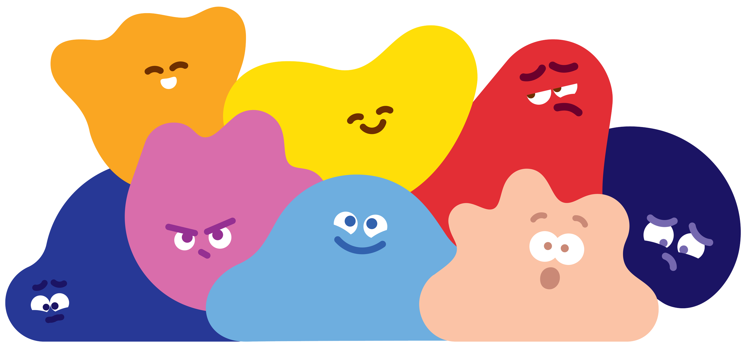
Meet the Characters:
Characters in the Wild
We’ve brought the caracters to life through branded materials and merch, making feelings tangible for everyone who encounters Intermountain Children’s Health.
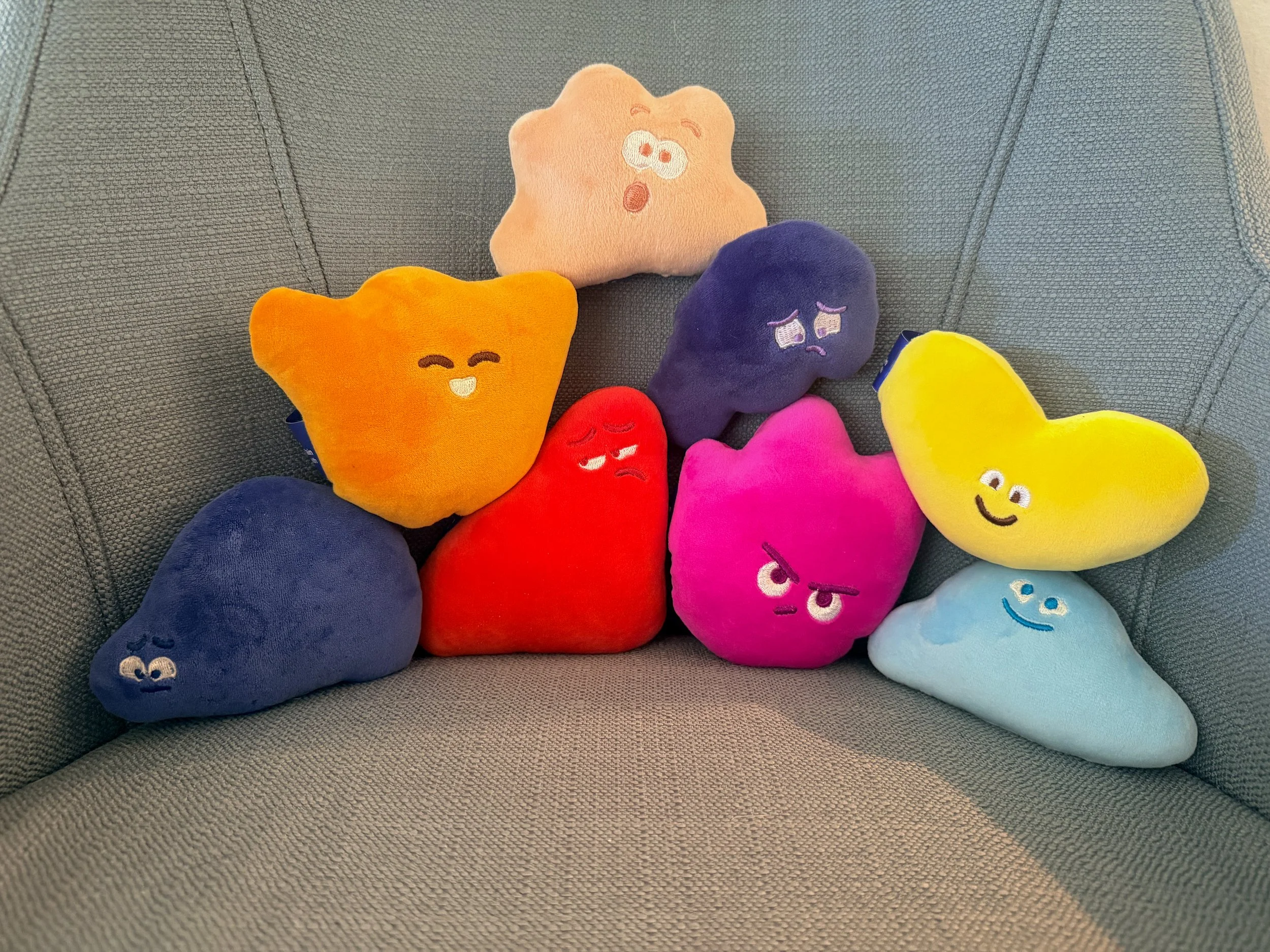
Plush bean bag characters to bring comfort and drive brand recognition and affinity.
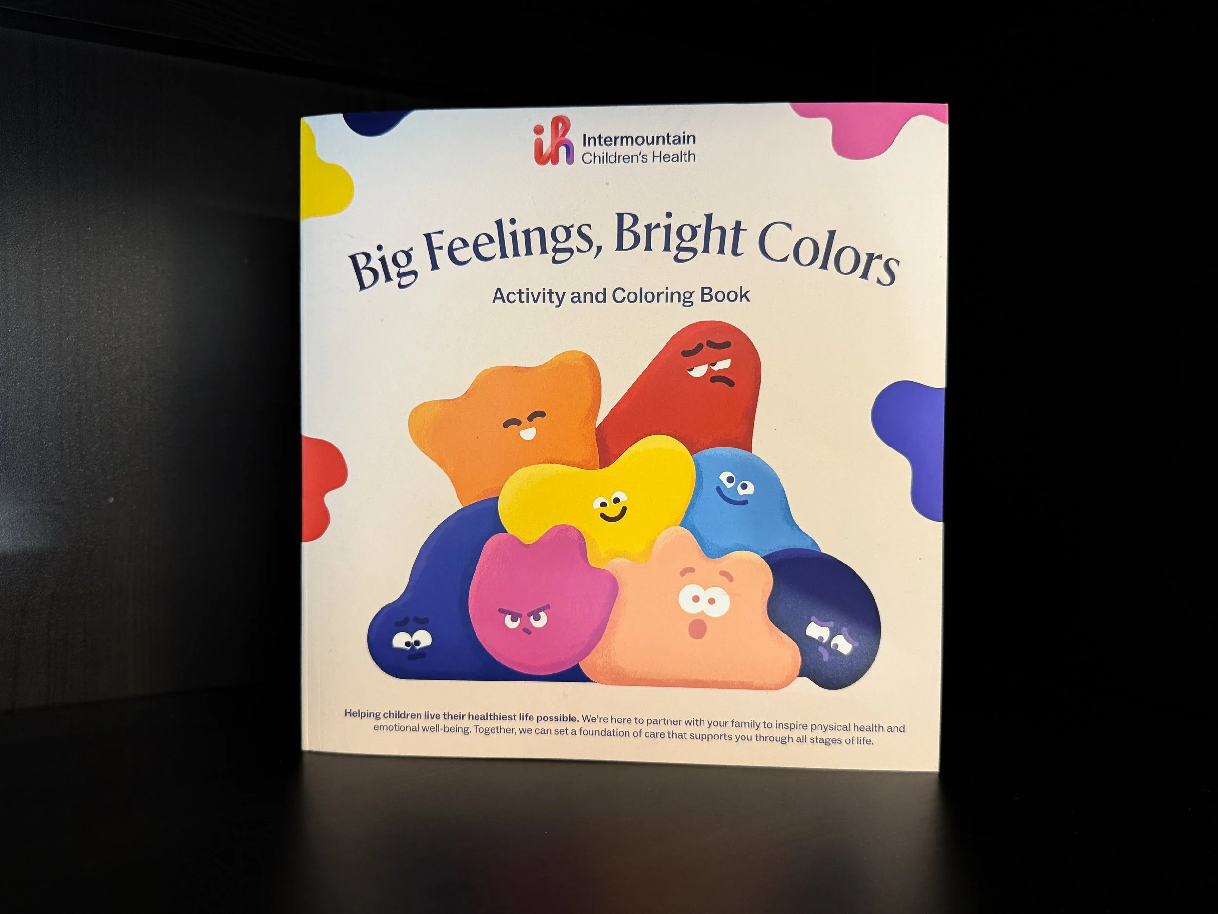
A character-themed coloring book, written by my team and professionally illustrated.
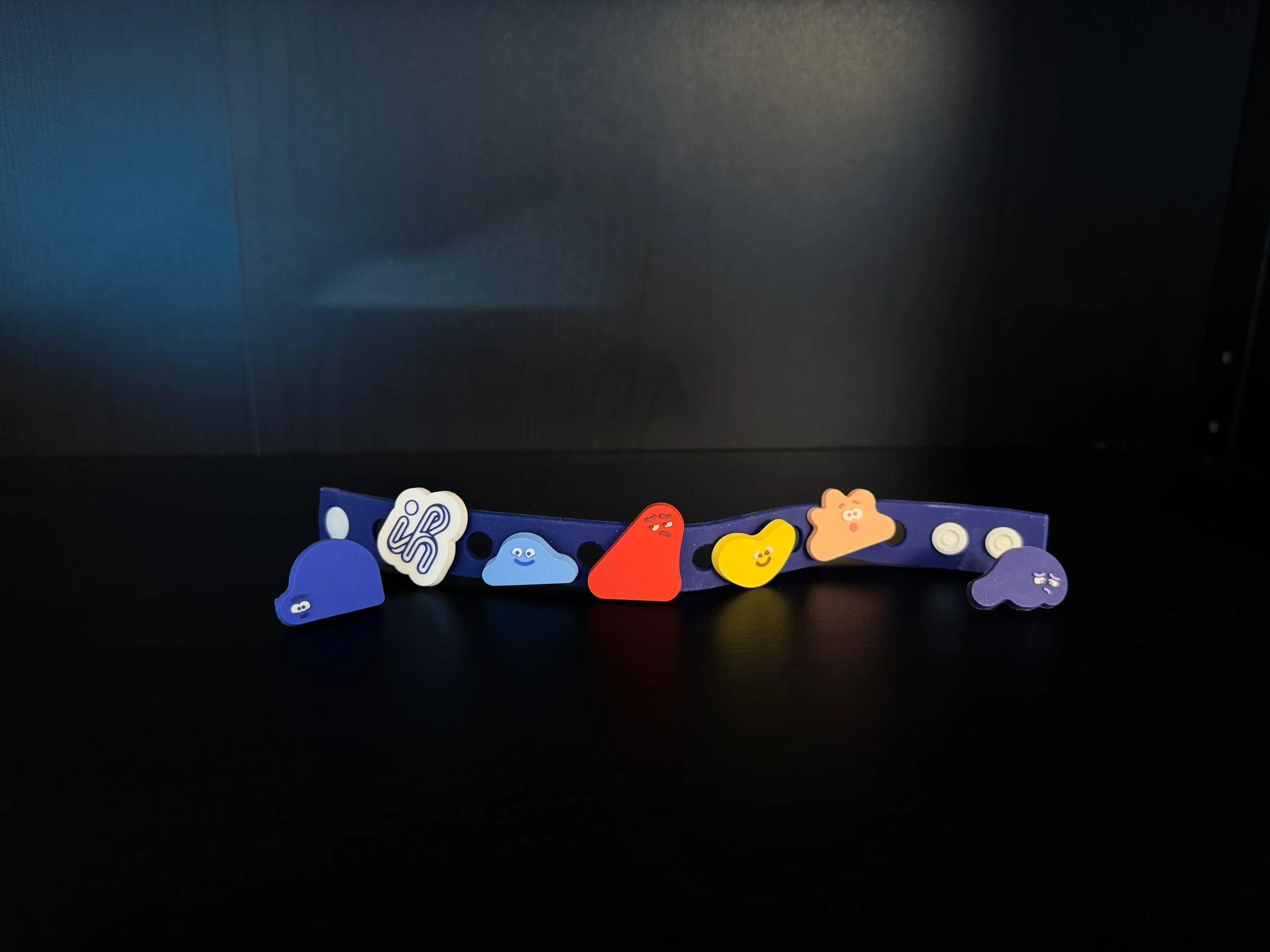
Rubber bracelets with collectible character “charms to take the feelings wherever you go.
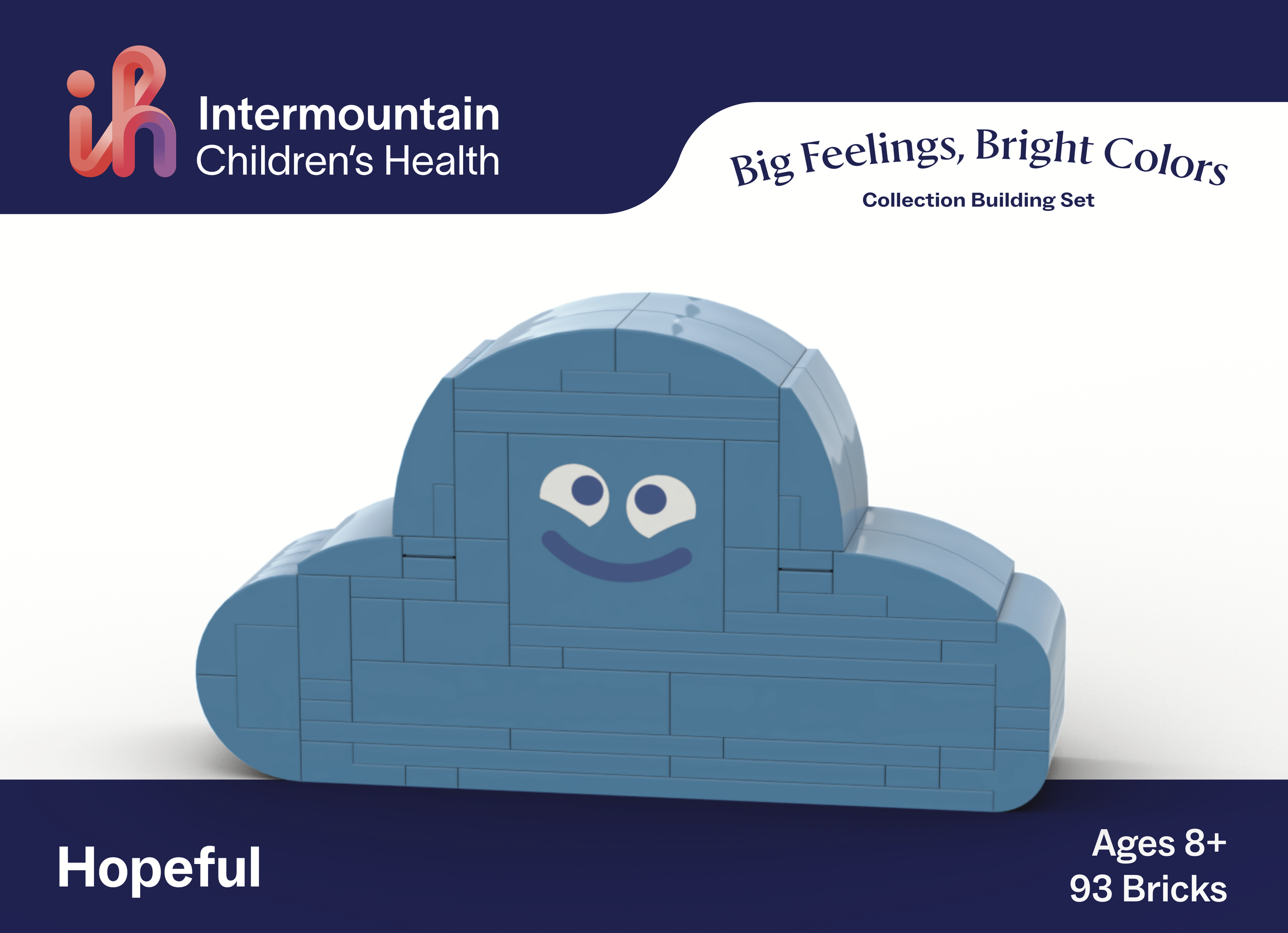
Big Feelings, Bright Colors building brick set – this one of the Hopeful character.
Emotion at the Brand’s Core
More than mere decoration, the characters were created to help establish empathy with young patients, reassuring them that what they feel is seen, understood, and valid.
The characters represent a wide spectrum of emotions: Anger (magenta), Happy (orange), Disgust (Terracotta), Hopeful (light blue), Love (yellow), Sad (dark blue), Surprise (peach), and Fear (cobalt).
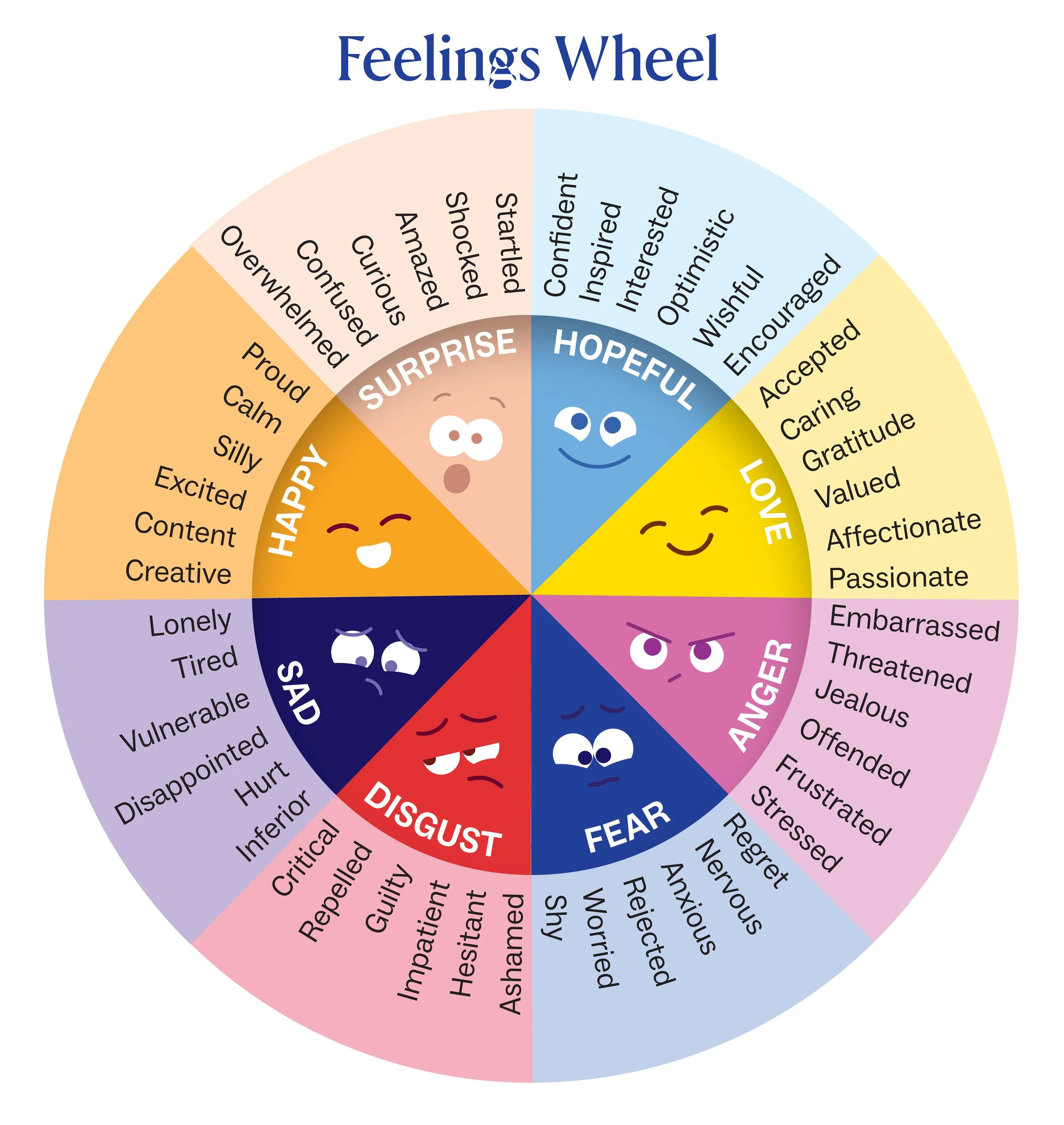
Developed in partnership with Intermountain Children’s Health behavioral health experts, they are incorporated into clinical and community health settings as much as they are brand and marketing. This “Feelings Wheel,” for instance, helps kiddos identify and name what they’re feeling, promoting emotional literacy and helping parents and providers understand how they can best support the child. Feel free to download the feelings wheel to help the children in your life (or yourself) identify emotions.
Ads: The Brand in Action
-
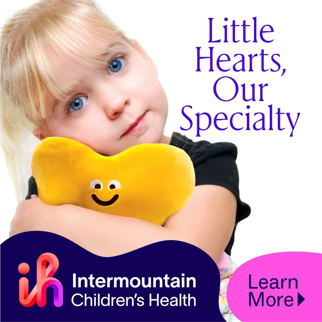
![Intermountain Children's Health cardiology ad with a girl hugging a yellow heart plush and the text "Little Hearts, Our Specialty."]()
Children's Cardiology Ad
-
![]()
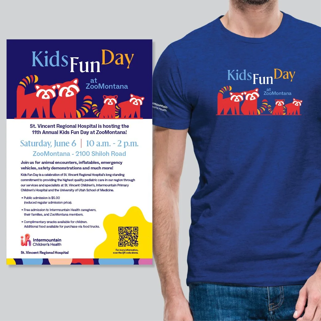
Kids Fun Day Event Promotion
-
![]()
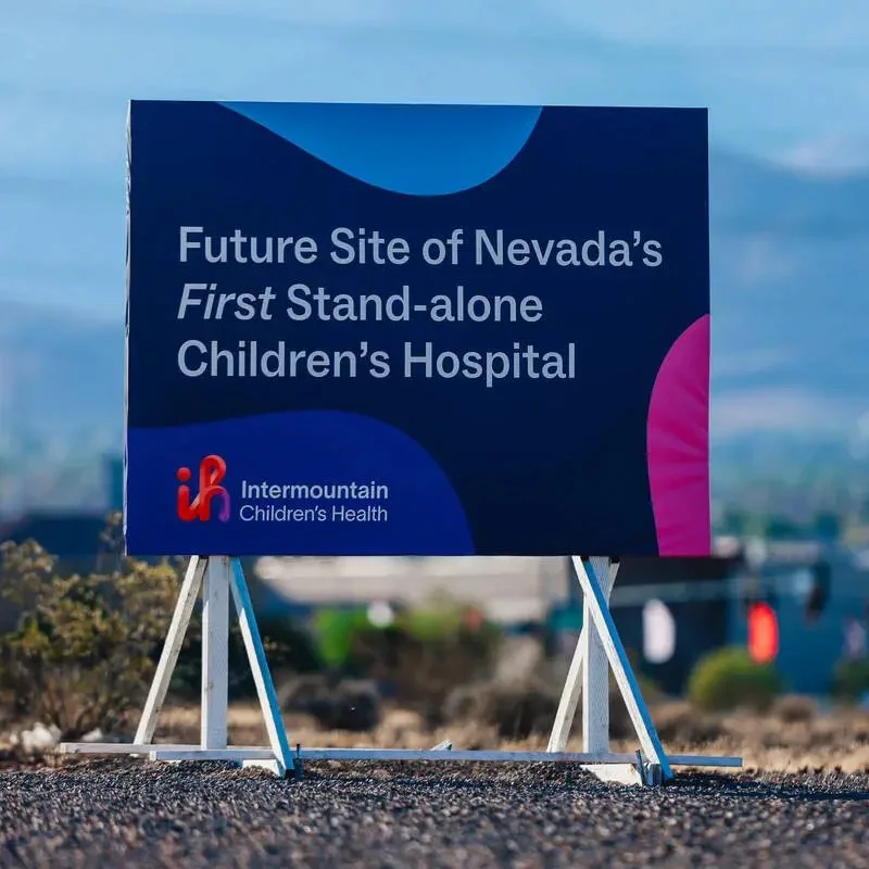
Hospital Site Unveiling Sign
-
![]()
In Your Neighborhood New Clinic Ad
-
![]()
Announcement at Allegiant Stadium


Stretching the Brand Across All Ages
Though the characters are the heart of the brand, it was built to resonate across age groups by utilizing our broad toolbox of brand elements.
Newborn
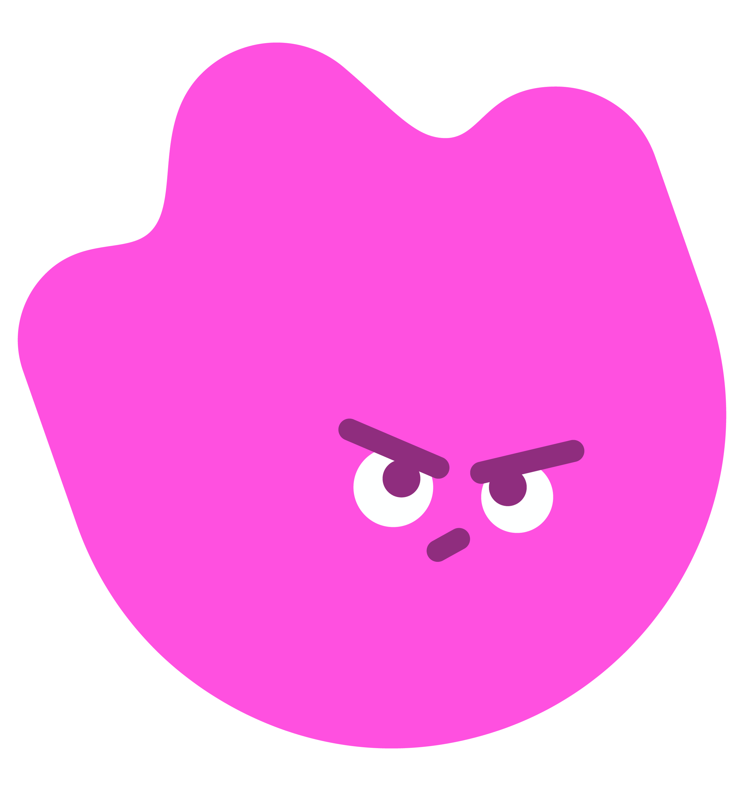
Characters
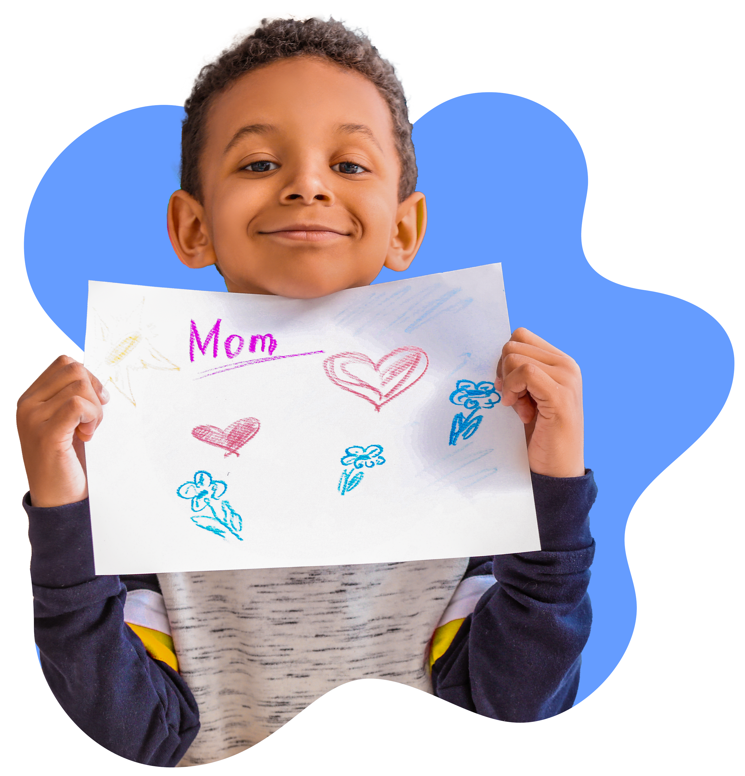
Shapes & Photos
Teenager

Pattern